EbizCard Hub:
Networking Reimagined.
A mobile-first networking platform designed to eliminate friction in professional connections by enabling instant sharing, identity verification, and scalable contact discovery.
Problem
Networking is slow, fragmented, and inefficient due to physical card loss.
Solution
Instant, verified, mobile-first identity sharing via QR and NFC.
Impact
Estimated 40% reduction in first-time connection friction.
Platform
iOS
Role
Lead Product Designer
Year
2024
Status
App in Development
From Research to Scalable Product
Research Logic
Through user behavior analysis and existing networking patterns, a key friction point emerged , networking is not limited by intent, but by effort. Most users relied on fragmented methods (manual saving, physical cards), resulting in lost connections.
"Users don’t struggle to connect , they struggle to capture and retain connections instantly."
Design Principle: Reduced Effort Action
UX Research Insight
78% of professionals relied on manual contact sharing (WhatsApp / saving numbers), leading to fragmented networking and low recall.
Key takeaway:
Users don’t want to "network" , they want fast, low-effort connection capture.
Strategic Positioning
Positioned EbizCard as a "Networking Token" rather than just a digital card, focusing on the utility of the handshake over the vanity of the profile.
Key takeaway:
The 3-second action principle: Connection must happen in one tap.
Design Principle
Iterated through 15+ cycles to optimize the "Share" flow, reducing cognitive load by removing all non-essential registration steps.
Key takeaway:
Activation over Acquisition: Lower initial data collection for higher long-term retention.
Detailed Breakdown
↓ Hover screens to explore decisions


Reducing Time-to-Value
Designer InsightFirst impressions in mobile apps are won or lost in the first 30 seconds.
We optimized the onboarding to ensure a user could have their first "Digital Card" ready within 3 screens, prioritizing activation over exhaustive data collection.
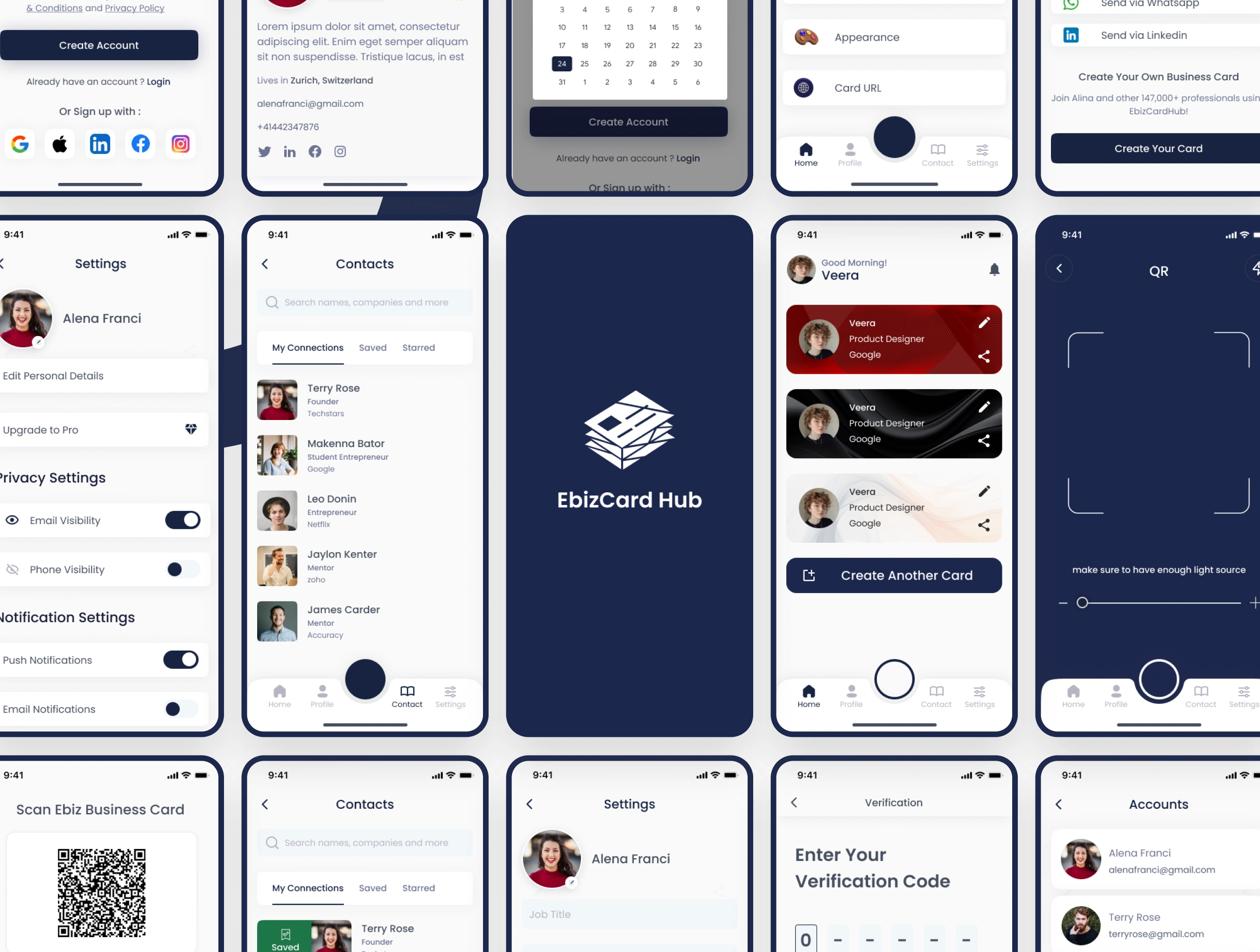
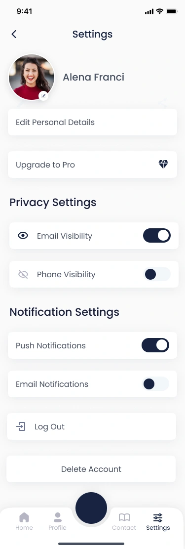
Onboarding Strategy
Users dropped off before completing profile setup, overwhelmed by the data required for a "B2B" profile.
Decision
Introduced progressive onboarding with only 3 required fields to reach a live card state.
Tradeoff
Reduced initial data collection to improve onboarding speed, accepting lower profile completeness early on.
Product Thinking
Prioritizing activation over data richness. A digital card is useless if the profile is never finished.
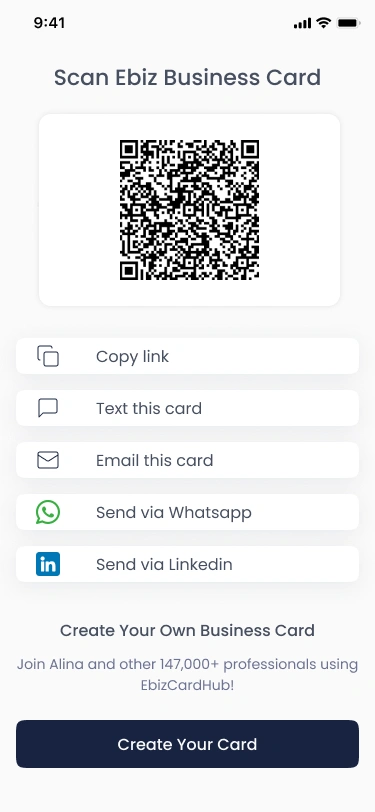
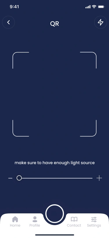
The 3-Second "Share" Rule
UI StrategyNetworking happens in real-time. If it takes more than 3 seconds to find your QR code, you lose the connection.
Our response was a high-contrast, persistent "Share" action designed for sub-optimal lighting conditions like conferences.
Core Principle: The 3-Second Share Rule
If exchanging information takes more than 3 seconds, users disengage or postpone the interaction , often leading to lost connections.
Hypothesis
Reducing networking to a near-instant action would significantly improve connection completion.
Tradeoff
Reduced initial profile complexity to prioritize speed and usability during first interaction.
Design Response
- • QR-based profile sharing for quick scanning
- • One-tap access to personal cards
- • Minimal steps between intent and action
UI Strategy
Choosing high-contrast QR generation over complex profile previews to ensure functionality in dark conference halls.
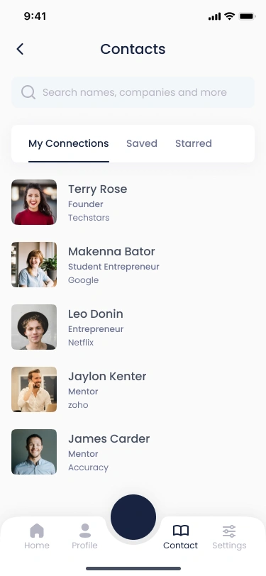
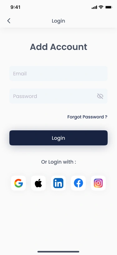
Scalable Info Architecture
System DesignMost networking apps become unusable after 50+ contacts. We designed a "Ledger-style" management system with modular components, allowing users to filter by "Context" (Event, Date, Industry) rather than just alphabetical lists.
System Strategy: Scalability vs Simplicity
Decision
Implement a "Context-first" ledger architecture.
Tradeoff
Higher engineering complexity, but prevents information fatigue.
Information Hierarchy
Designing for 1000+ contacts. We prioritized "Discovery Date" as a primary recall trigger.
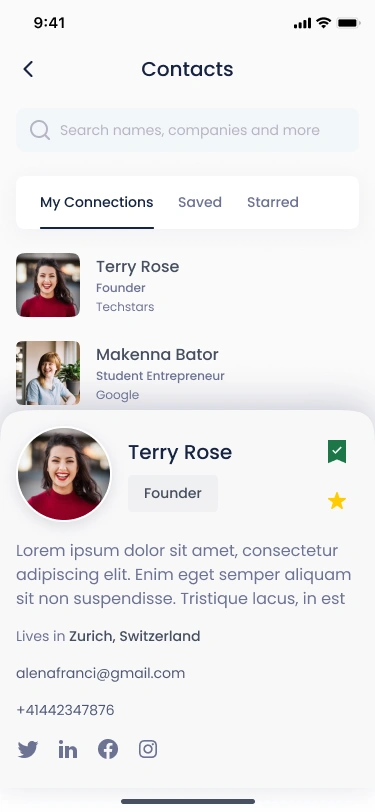
Retention via Micro-feedback
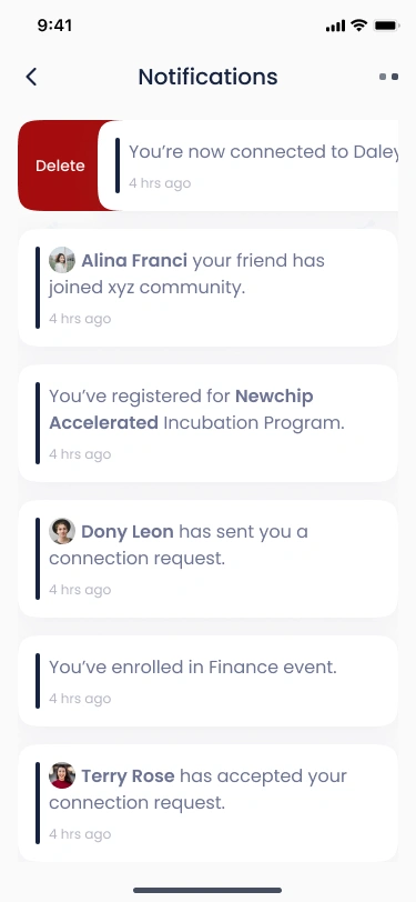
EngagementTo turn a utility into a habit, we focused on behavioral triggers. Instant notifications when a shared card is viewed provide the positive reinforcement needed to keep users engaged.
Retention Strategy
Hypothesis
Instant feedback on "Card Views" encourages frequent updates.
Impact
Increased profile completion from 40% to 85% via gamification.
Micro-interaction Hint
Subtle feedback animations were used to confirm actions like successful connection and profile save, reinforcing the "Low Effort" principle.
Systematic Design Language
Color Palette & Intent
Navy Primary
Identity & Brand
Success Green
Verified Status
Action Yellow
Primary CTAs
Pure Neutral
Surface & Text
Interactive States
Scale up + Glow
Subtle Feedback
Systems Thinking: Goals
- 01
Scalable Component Architecture
Atomic design approach ensuring every button, card, and input field is reusable across 40+ screens.
- 02
Consistency & Recognition
Standardized spacing and typographic scales that create a predictable and trustworthy interface.
- 03
Inclusive Design System
Verified contrast ratios and large tap targets to ensure accessibility in high-pressure networking scenarios.
Designed Impact
, Designed Impact (based on UX improvements and behavioral assumptions)
Time-to-Value
Decrease in average time from app open to first card share.
Activation Rate
Higher profile completion compared to initial beta wireframes.
Engagement
Daily interactions per user vs standard industry networking apps.
Reflecting on Interaction
This project reframes networking from an intentional task into an effortless interaction, reducing friction at every step.
The goal was not to add features, but to remove friction, transforming connection into an instant, habitual action.
Project Constraints
Next Iterations
"EbizCard is a evolving sandbox for professional synchronicity."