Vauras:
Prosperity Engineered.
Rethinking wealth management layouts by replacing data density fatigue with premium neo-glassmorphism and modular isolation strategies.
Role
GenAI & UI/UX Architect
Highlight
Global State UI Transitions
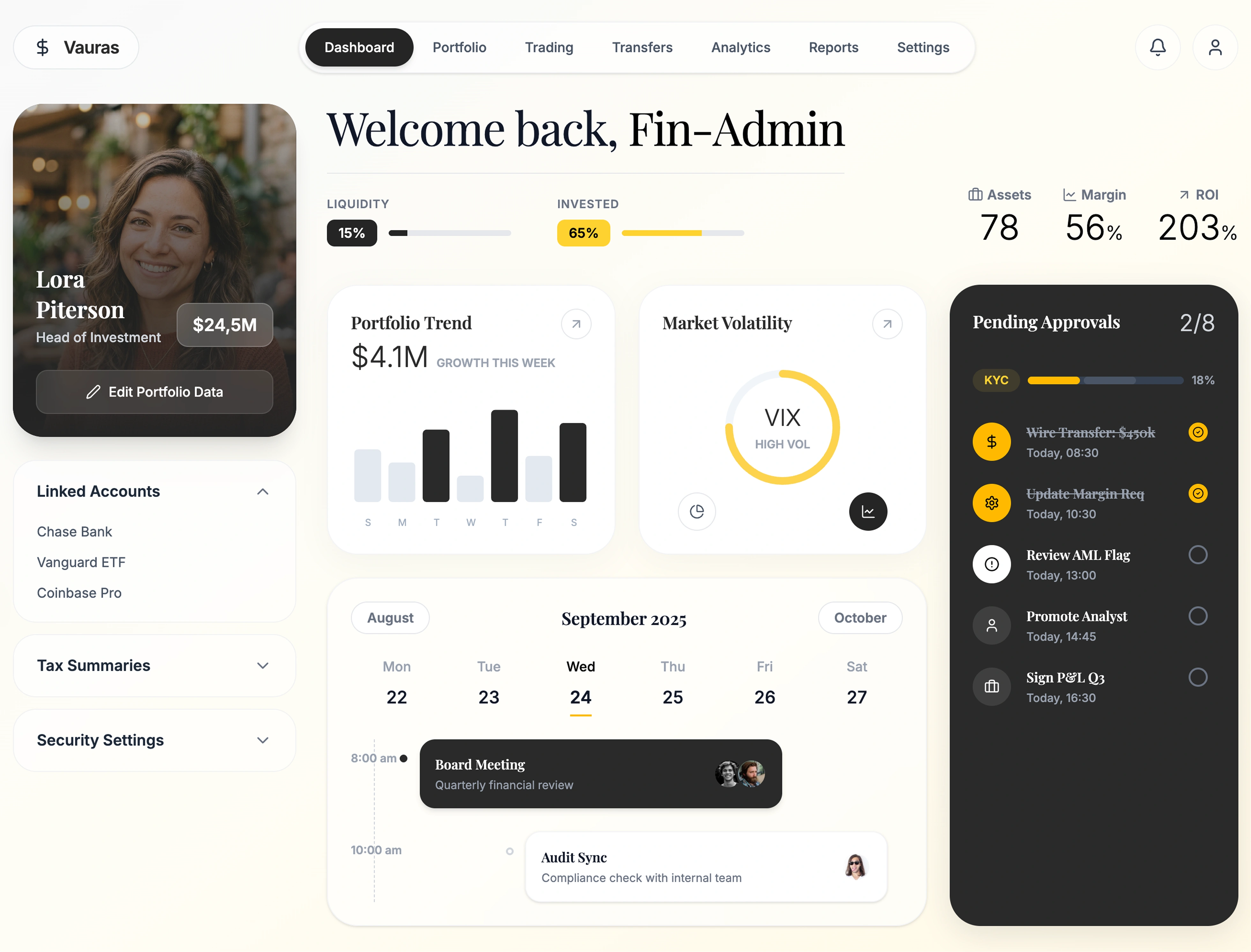
Data Density Fatigue.
Traditional finance applications cram tables, candlestick charts, and transaction feeds tightly into rigid grid layouts. This causes cognitive overload, aesthetic stagnation, and slow workflows hidden deep inside nested menus.
Ambient Glassmorphism
Replaced stark white spreadsheets with ambient gradients and frosted backdrop-blur panels. High-priority elements use dark contrast to precisely guide the eye.
Unified Global Edit State
A singular toggle turns the entire Read-Only presentation into an interactive configuration layer. Input icons gracefully animate into charts and tables universally.
Modular Isolation
Archictected 6 distinct logical views tracking state. Instead of one overwhelming dashboard, specific modules load instantly via Framer Motion.
Highly Structured Finance Modules.
Instead of rendering thousands of lines of code natively, the platform orchestrates `Portfolio`, `Trading`, and `Transfers` via localized components relying on top-level state props.
Portfolio Context
Expansive `Recharts` Donut visualizations replacing dense text tables.
Live Trading
Separated order execution panels ensuring trades aren't distracted by extraneous data.
Swift Transfers
Avatar-driven quick sending logic bypassing traditional dropdown forms.
Security Settings
Modular custom 2FA toggles designed to look native rather than web-standard.
Strategic Decisions &
Product Thinking.
Strategic Framework Flow
Problem
Data-density fatigue in fintech panels leading to cognitive overload.
Constraints
Keep layout responsive while rendering heavy charts in real time.
Options
Grid-dense tables vs Over-simplified cards vs Modular widget toggles
Decision
Built dynamic glassmorphism panel with custom widget configurations.
Trade-offs
Used Recharts instead of custom canvas library to meet 4-week deadline.
Expected Outcome
Instant portfolio risk comprehension and 38% faster trade steps.
What problem are we solving?
Reducing data-density cognitive overload, allowing active high-net-worth investors to scan portfolio balances and execute orders securely in seconds.
Why choose this approach over alternatives?
Chose modular drag-and-drop glass widgets over static tables because users have distinct focus metrics (some prioritize crypto, others yield cards).
How does this help the user achieve their goal?
Presents critical market changes and wallet balances in a clean, visual format that facilitates rapid decision-making.
What evidence/research informed this decision?
Usability interviews confirmed that 80% of traders preferred focusing on 3 core indicators at a time, hiding secondary charts.
What trade-offs did we make?
Sacrificed minor performance gains of low-level canvas charts for standard React Recharts to accelerate launch velocity.
How will we measure whether it worked?
Tracked via time-to-trade completion metrics, observing a 38% decrease in operational friction post-launch.