Lock-IT / Fitness accountability
A promise to yourself.
A reason to follow through.
Turning fitness intentions into daily commitments through personal stakes, visible progress, and a moment to reflect.
01 / The design challenge
Starting is a moment.
Consistency is a system.
Lock-IT explores the gap between deciding to exercise and showing up again tomorrow. Its central idea is to make a commitment tangible, then make each day’s next step clear.
The tension
Motivation fluctuates.
A goal alone does not explain what to do today, what counts as completion, or how to return after a missed session.
The approach
Make the promise explicit.
Connect a chosen activity to a consequence, a workout plan, and a visible record of follow-through.
The balance
Leave room to recover.
Rest days, review states, journaling, and milestones sit alongside the stakes. The experience needs to support returning as well as completing.
- 01
Commit
Choose a workout and a consequence.
- 02
Act
Follow a plan and record the session.
- 03
Verify
Review evidence and track the result.
- 04
Reflect
Notice progress and prepare to return.
02 / Make a commitment
A clear choice.
A personal stake.
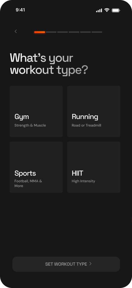
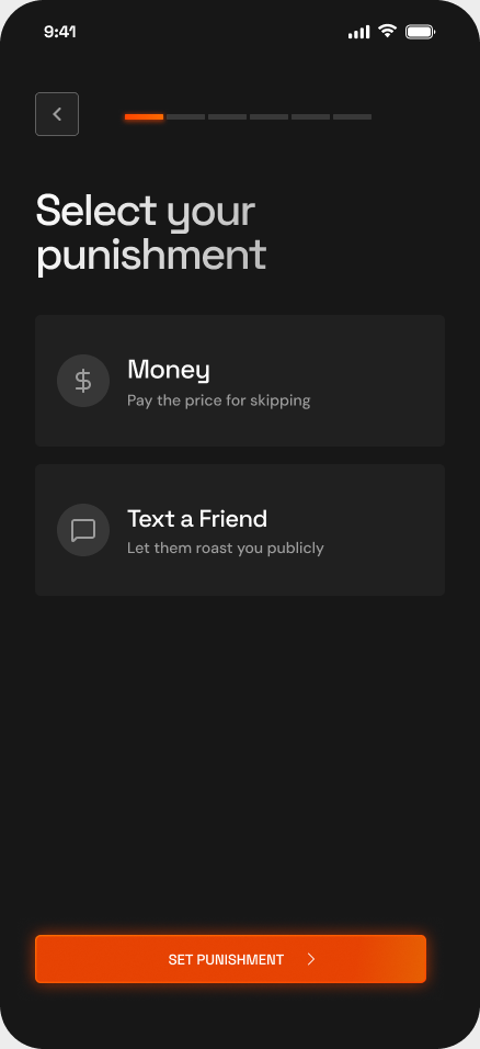
The setup breaks a large promise into smaller decisions. First choose how to train, then choose the consequence attached to the commitment.
One decision at a time.
Gym, running, sports, and HIIT are presented as distinct choices. The progress indicator gives the setup a visible direction, while the primary action stays tied to the current step.
- Recognizable activities
Concrete options make the initial choice easier to understand than an open-ended goal.
- A deliberate consequence
The design offers a financial stake or a message to a friend. Choosing between them gives the commitment a personal meaning.
- The trade-off to validate
Stronger stakes may motivate some people and discourage others. Test whether the consequence is understood and feels freely chosen before confirmation.
03 / The everyday experience
Know what to do.
Know what counts.
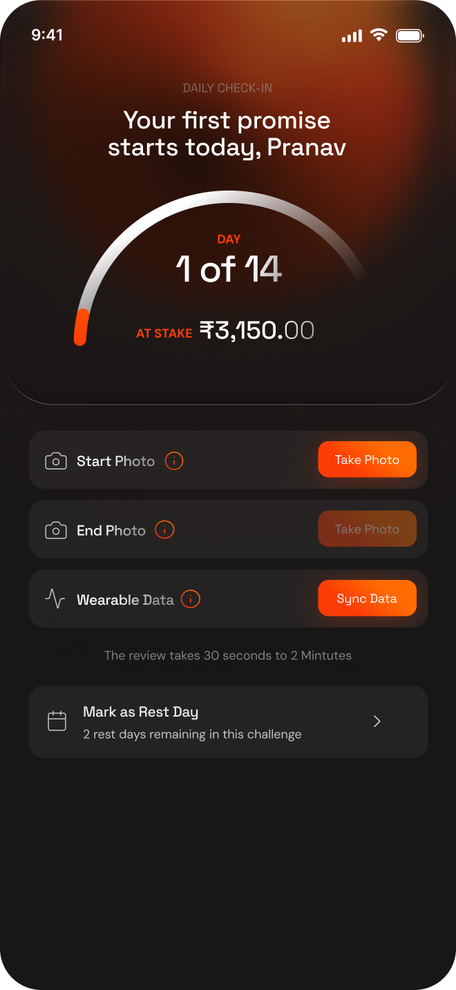
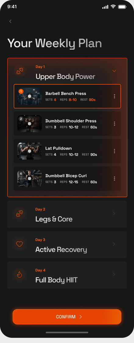
A commitment becomes actionable through a weekly plan and a daily check-in. Training guidance and evidence collection answer two different questions in the same journey.
From intention to a completed session.
The weekly plan expands a training day into exercises, sets, repetitions, and rest periods. Check-in then makes the required evidence visible: start photo, end photo, and wearable data.
- Progressive detail
Expandable days keep the week scannable while showing the detail needed for the selected workout.
- Visible review expectations
The check-in screen explains that verification takes time. Submission and approval are separate steps, rather than an instant success assumption.
- A recovery route
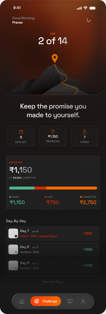
“Mark as Rest Day” shows the remaining allowance. On the challenge dashboard, daily history distinguishes verified sessions from failed sessions with an appeal available.
04 / Trust & transparency
Every commitment
has a visible balance.
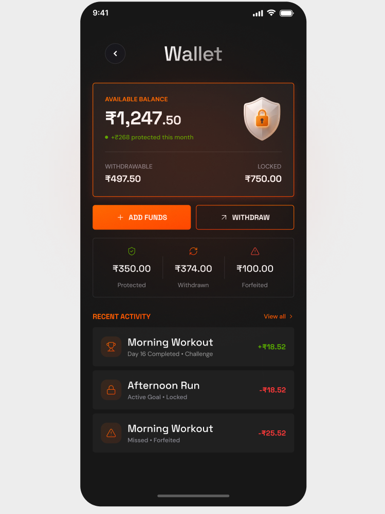
When money is part of motivation, the interface needs to explain where it is and what happened to it.
- Available is not the same as withdrawable
The balance card separates withdrawable funds from locked funds, placing the distinction above the funding actions.
- History explains the change
Activity entries connect an amount to a workout and its status. Protected, withdrawn, and forfeited summaries provide a second level of context.
- Labels carry the meaning
Green, orange, and red reinforce the states. Text labels and transaction descriptions explain them beyond color alone.
05 / Beyond the streak
Make room for progress.
And for being human.
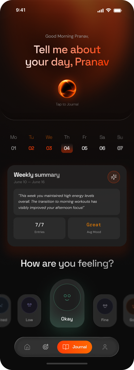
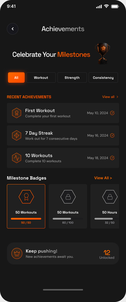
The journal and achievements extend the experience beyond passing or failing a workout. One captures how the day felt; the other makes accumulated effort visible.
A reason to come back.
The journal pairs a prominent recording entry point with a weekly summary and mood selection. Achievements organize milestones around workouts, strength, and consistency.
- Reflection beside performance
A mood check-in creates space for context that a completion percentage cannot express.
- Small wins stay visible
Unlocked badges and progress toward the next milestone give continued effort a recognizable shape.
- What needs validation
Test whether these surfaces encourage a return after a missed day, or become another obligation to maintain.
— / Visual language
Quiet surfaces.
Focused energy.
The product uses dark surfaces, warm orange emphasis, and status colors to establish hierarchy. The case study keeps the portfolio’s existing typography while the original screens retain their product typography.
Dark foundations
Layered charcoal surfaces group information and let the primary action stand out.
Orange for momentum
Warm highlights connect commitment, action, and active progress throughout the product.
Meaningful status
Success, commitment, and loss use distinct colors supported by labels and context.
06 / Design takeaways & next steps
Accountability needs
clarity and care.
The final designs bring commitment, training, verification, money, and reflection into one product journey. The next step is to test whether that journey supports sustainable follow-through.
Comprehension
Can users explain the stakes?
Ask participants to describe the consequence, identify locked funds, and find what they can withdraw before committing.
Daily usability
Can they complete the loop?
Observe a workout selection, proof submission, review-state check, and rest-day decision. Track errors and requests for help.
Longer-term behavior
Do they return after a miss?
Study repeat check-ins and return behavior over time, alongside how people feel about the consequences they selected.
This case study documents the supplied Figma designs and design rationale. Screen balances, streaks, and percentages are example interface data; research findings and measured product outcomes have not been supplied.
Explore the Figma designs (opens in a new tab)Continue exploring