Servify / Device lifecycle experience
Clarity at every step.
Confidence in every claim.
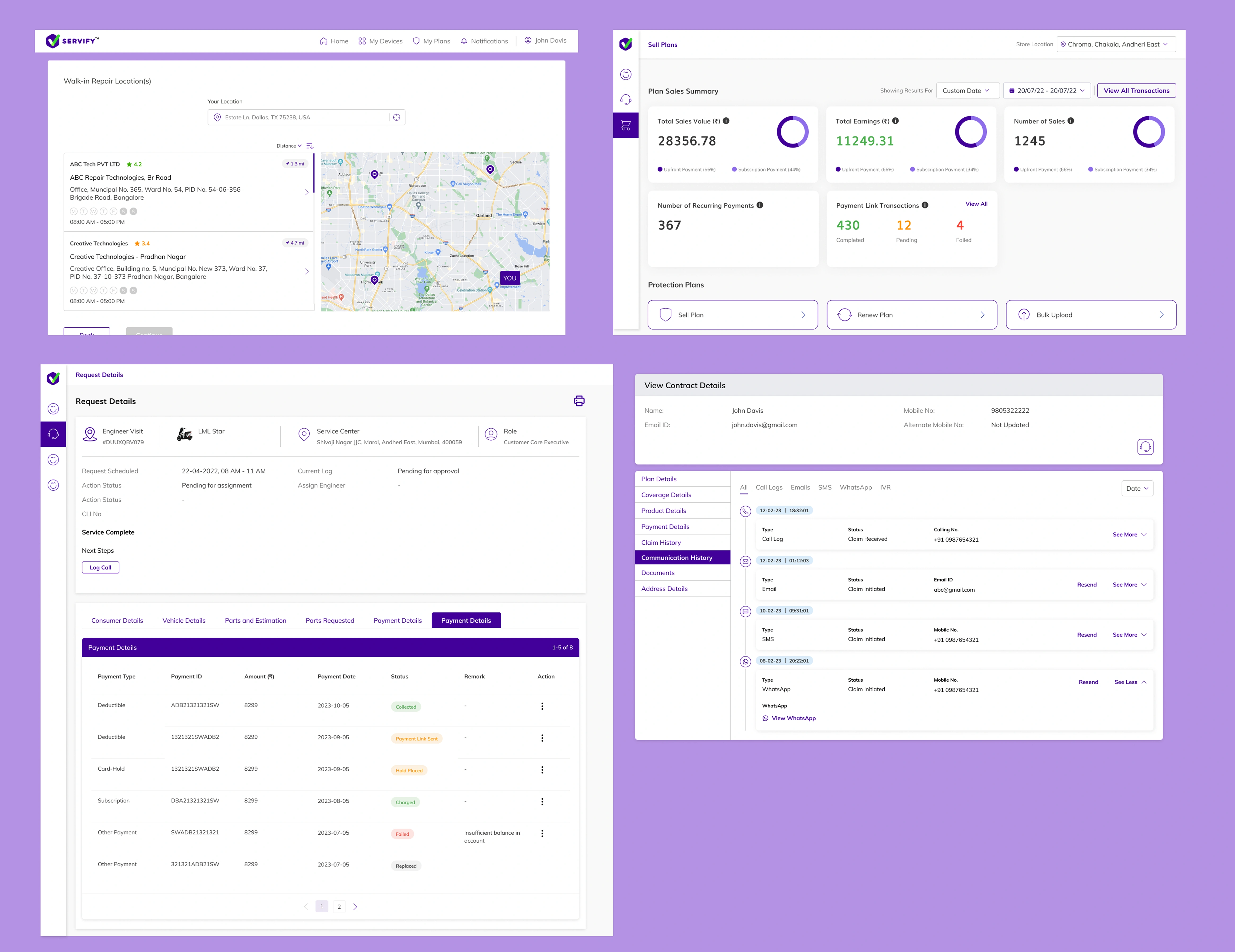
Connecting customer payments and service operations through a clearer device exchange journey. A closer look at the screens, states, and decisions behind the Servify experience.
Executive brief / TL;DR
60-second case summary
The challenge
Make payment uncertainty understandable for customers while giving service teams the context to move a device exchange forward.
My role & scope
Product Designer & Frontend Developer. This case study focuses on the customer payment journey, its recovery states, and the operational request view.
The design response
A connected flow with distinct payment outcomes, clear next actions, and a request history that keeps earlier events visible.
01 / The challenge
One request. Two sides of the experience.
A device exchange does not end at payment. Customers need to understand what happens to their request, while service teams need enough context to take the next action.
The customer
“Did my payment go through?”
A failed, pending, or successful transaction needs a distinct explanation and a clear next step.
The service team
“What needs to happen next?”
Payment status, request details, and the activity history need to be visible together.
The design response
Keep the journey connected.
Carry the request context from review to payment, confirmation, and operational follow-up.
02 / The journey
Design the next step, not just the screen.
The supplied flows connect request review, payment details, transaction feedback, and service follow-up. Each stage answers a different question.
- 01
Review
What am I requesting?
Device, service option, address, and amount payable.
- 02
Pay
What am I paying?
A dedicated payment form with the total shown first.
- 03
Understand
What just happened?
Specific feedback for failed, pending, and successful payments.
- 04
Continue
What happens next?
Retry, track the request, or follow the repair history.
Customer-facing checkout
A focused moment
for payment.
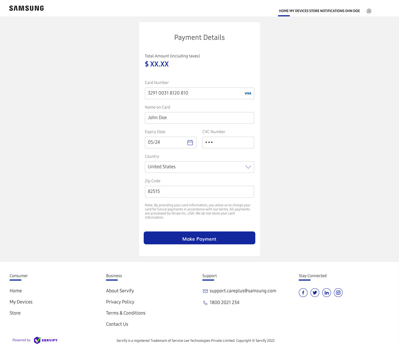
The payment screen gives the amount its own hierarchy before asking for card and billing details. A single primary action anchors the form.
- 01Show the total first
The amount, including taxes, appears before the fields.
- 02Group related details
Card details lead into country and ZIP code within one contained form.
- 03Explain payment handling
The notice describes Stripe processing and how card information is handled.
03 / Decisions & trade-offs
Make the complexity understandable.
Payment confirmation and repair progress are related, but they are not the same state. The design needs to explain both without asking customers to understand the underlying systems.
Payment uncertainty
Separate pending from failed.
The on-hold screen explains that confirmation is still outstanding and offers tracking.
A separate waiting state adds another branch, but avoids presenting an unconfirmed payment as a failure.
Two working contexts
Keep customer and agent views distinct.
Customers see a next step; agents see request context, operational actions, and history.
Each audience needs different information, while both views must describe the same request consistently.
Multiple brand contexts
Keep the pattern, adapt the expression.
Samsung checkout and Servify operations retain their own visual language.
Brand flexibility needs consistent meanings for payment, status, and next actions across both experiences.
04 / Payment states
The edge cases are part of the journey.
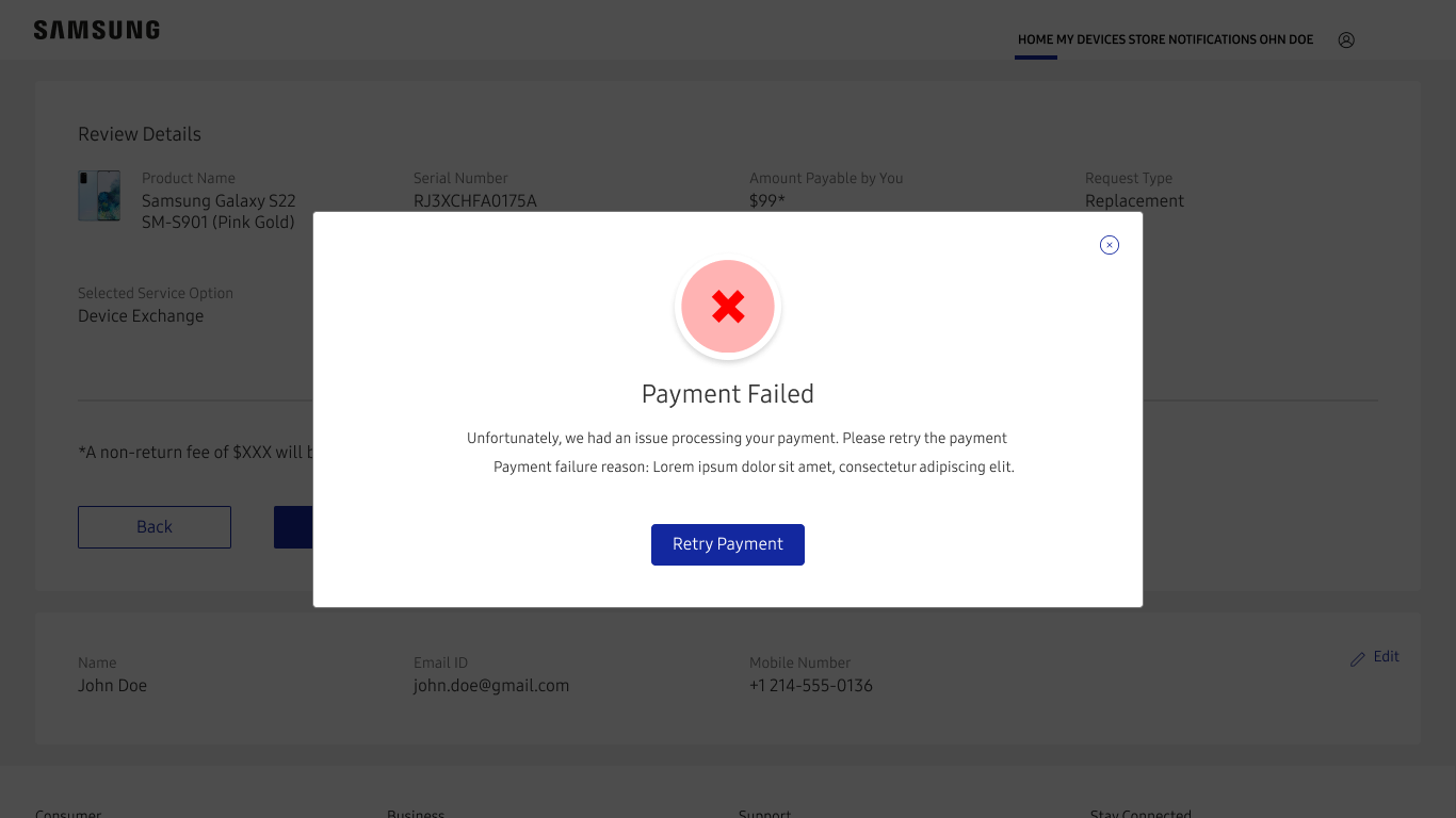
A generic confirmation cannot explain every outcome. These three original Figma screens show how the journey changes with the payment state.
Payment failed
A setback with a way forward.
The failure message explains that the payment could not be processed and brings “Retry Payment” into focus. The request review remains visible behind the dialog, preserving context.
Next step: retry payment
05 / Service operations
The same request. A different point of view.
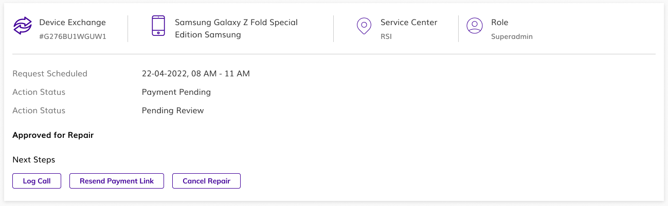
For service teams, the task is to understand the request and act on it. The operational view brings device context, next actions, and request history together.
Context before action
Keep the essentials close.
Device, service center, role, and scheduling information sit above the next steps, so the agent can review the request before acting.
Support the recovery
Give the team a way forward.
Log a call, resend a payment link, or cancel the repair. These visible actions connect the payment journey to operational follow-up.
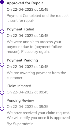
The timeline records review, claim initiation, payment events, and approval for repair. Earlier events remain visible alongside the latest update.
06 / Design system
A consistent foundation. Room for each brand.
The Servify operations screens use Mulish with purple and green accents. The Samsung customer journey uses its own brand treatment while retaining clear form, feedback, and action patterns.
Product typeface / Mulish
Aa
Clear details.
Confident next steps.
Heading16 / Bold
Body14 / Semibold
Supporting text12 / Regular
Servify product palette
More than a color change.
Failure, waiting, and completion each have a distinct icon, message, and next action. Meaning is carried by the whole state.
07 / Validation criteria
Turn design intent into clear checks.
The screens establish the intended behavior. These are the acceptance criteria for testing the live product; the supplied material does not include usability-session results or production analytics.
Payment clarity
Ask a customer to explain whether their payment failed, is pending, or succeeded.
They can identify the state and choose the relevant next action without assistance.
Recovery continuity
Walk through a failed payment and the retry route.
The device exchange details and amount remain consistent, and the customer understands what they are retrying.
Operational handoff
Ask a service agent to identify the latest request event and the next available action.
They can distinguish payment events from repair status and locate the appropriate follow-up action.
Accessible feedback
Check focus, keyboard navigation, status announcements, and message contrast in the implemented product.
Each outcome is understandable without relying on color, and its primary action is reachable by keyboard.
08 / Design outcomes & learnings
A connected experience, from payment to repair.
The design deliverables make the customer journey and the service workflow easier to follow. Their value is visible in the covered states and actions; business impact still needs to be measured in use.
03
Payment outcomes
Failed, pending, and successful payments each have their own feedback and next step.
02
User perspectives
Customer-facing checkout and service-team operations address different tasks within the same journey.
01
Continuous request history
Review, payment events, and approval for repair remain visible in the activity timeline.
Key learnings
Uncertainty needs its own state.
A pending payment needs an explanation and a tracking route, rather than the same treatment as a failed payment.
Recovery belongs in the core flow.
A retry action is part of the payment experience. It should retain the context that helps customers proceed confidently.
History gives status meaning.
The latest label answers what is happening now. The timeline explains how the request arrived there.
Business reasoning & measurement
Support self-service recovery
A visible retry route is intended to help customers continue without contacting support.
Measure retry-to-success completion.
Make waiting understandable
An explicit pending state can help customers understand why the request is on hold.
Measure payment-status support contacts.
Support the service handoff
Visible next actions and history help agents decide how to follow up.
Measure time to the next appropriate action.
Final reflection
A clear next step is
part of the service.
The strongest connection between these screens is continuity: understanding the payment, recovering when it fails, and keeping the request visible to everyone involved.
Explore the original Figma screens (new tab)